
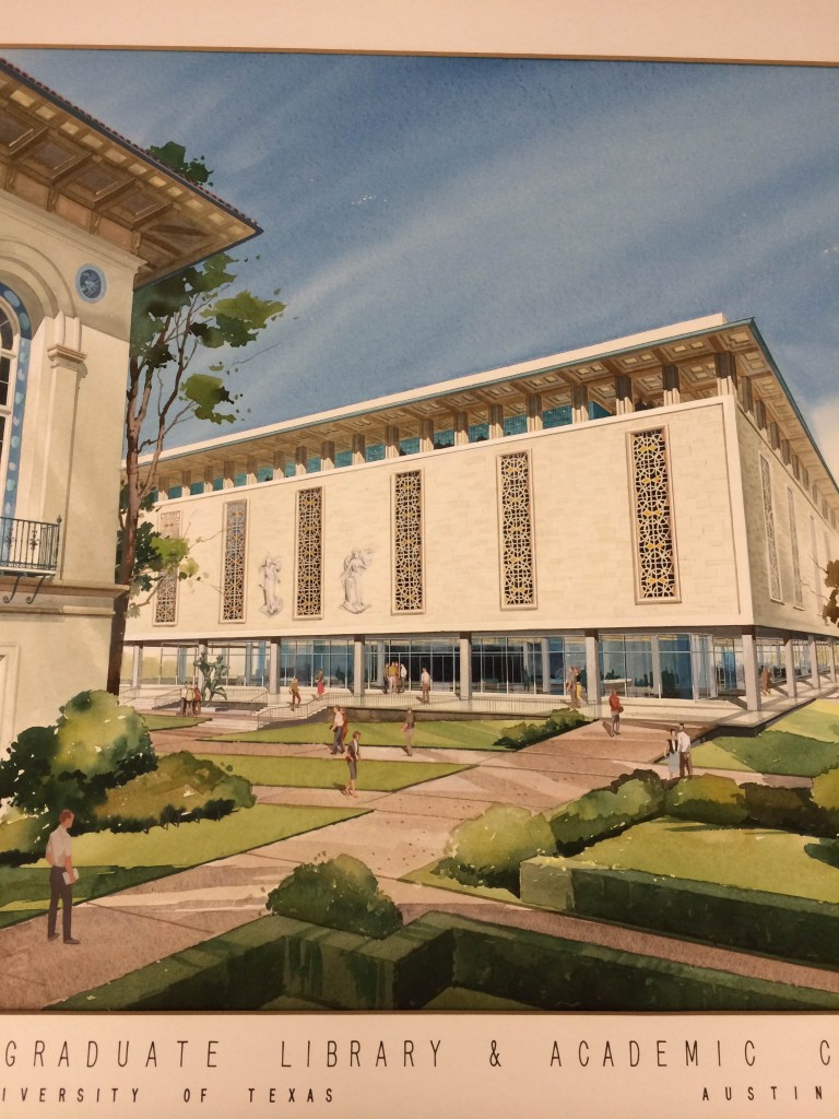
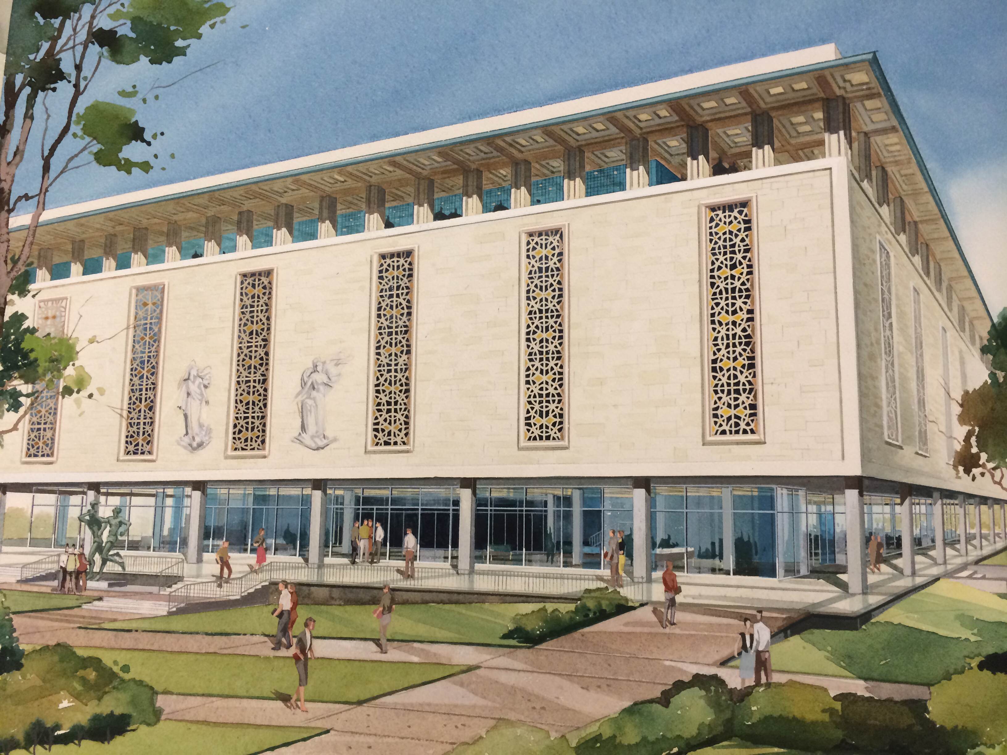
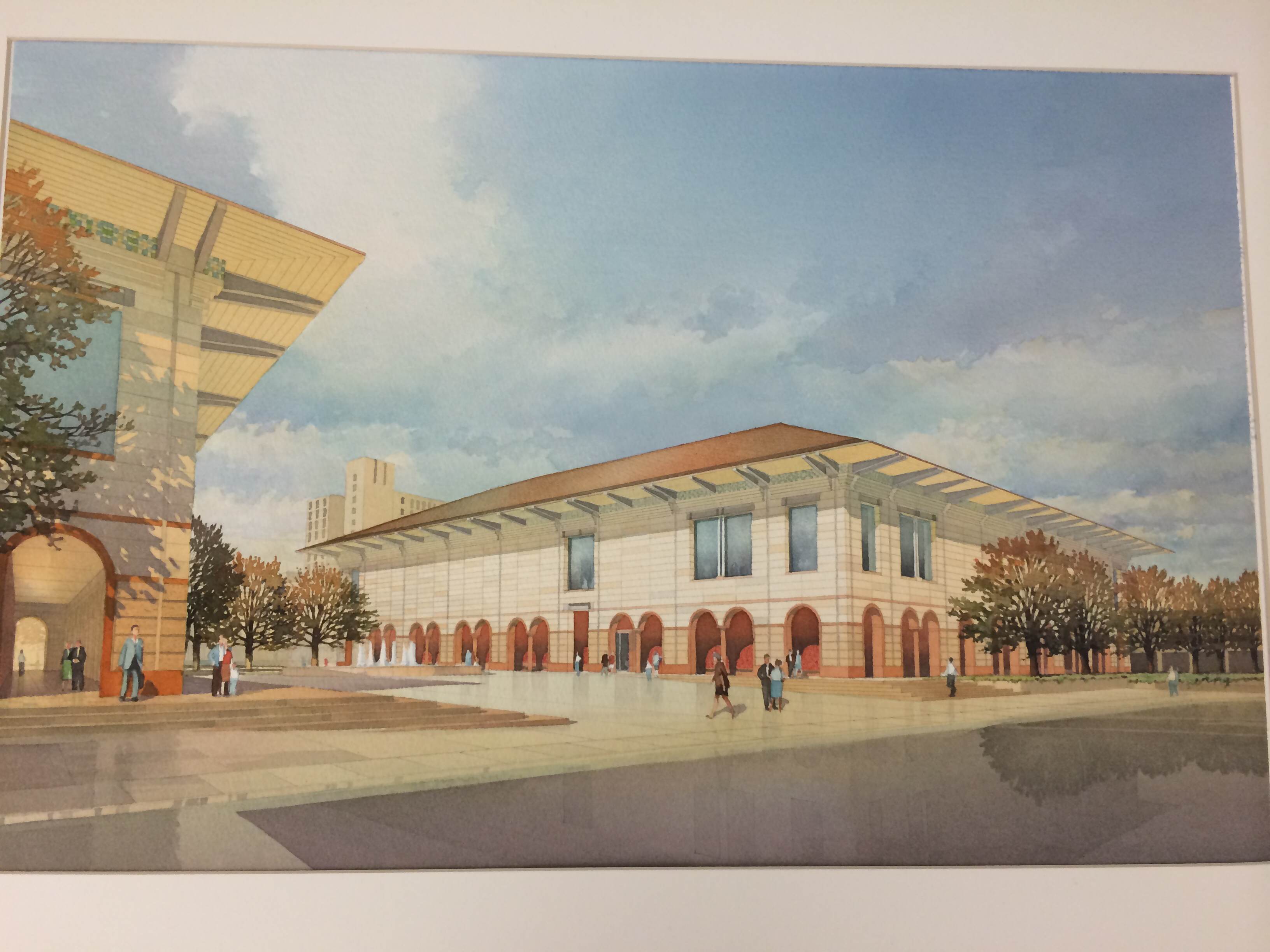
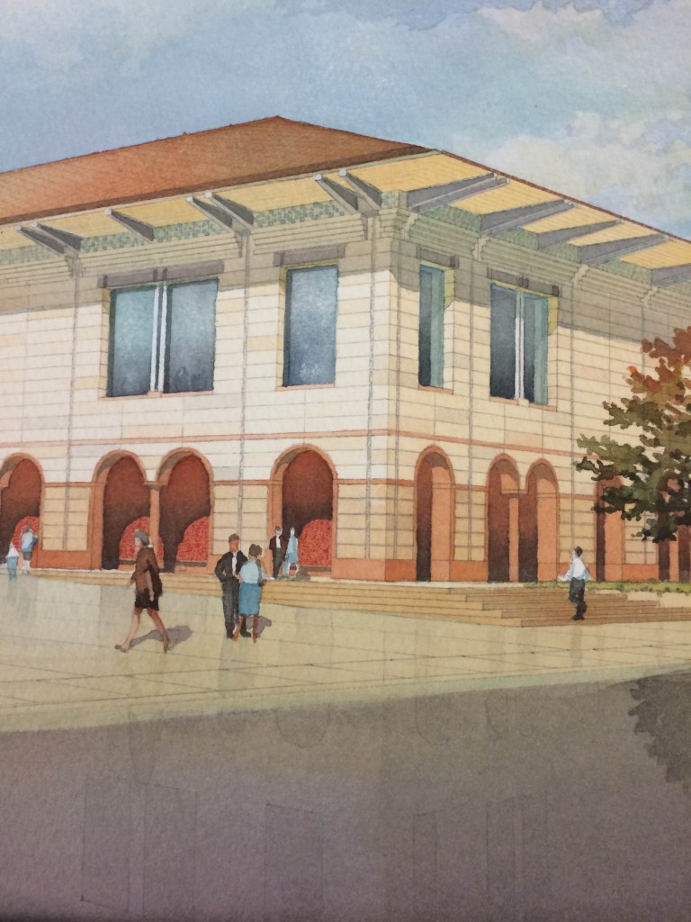
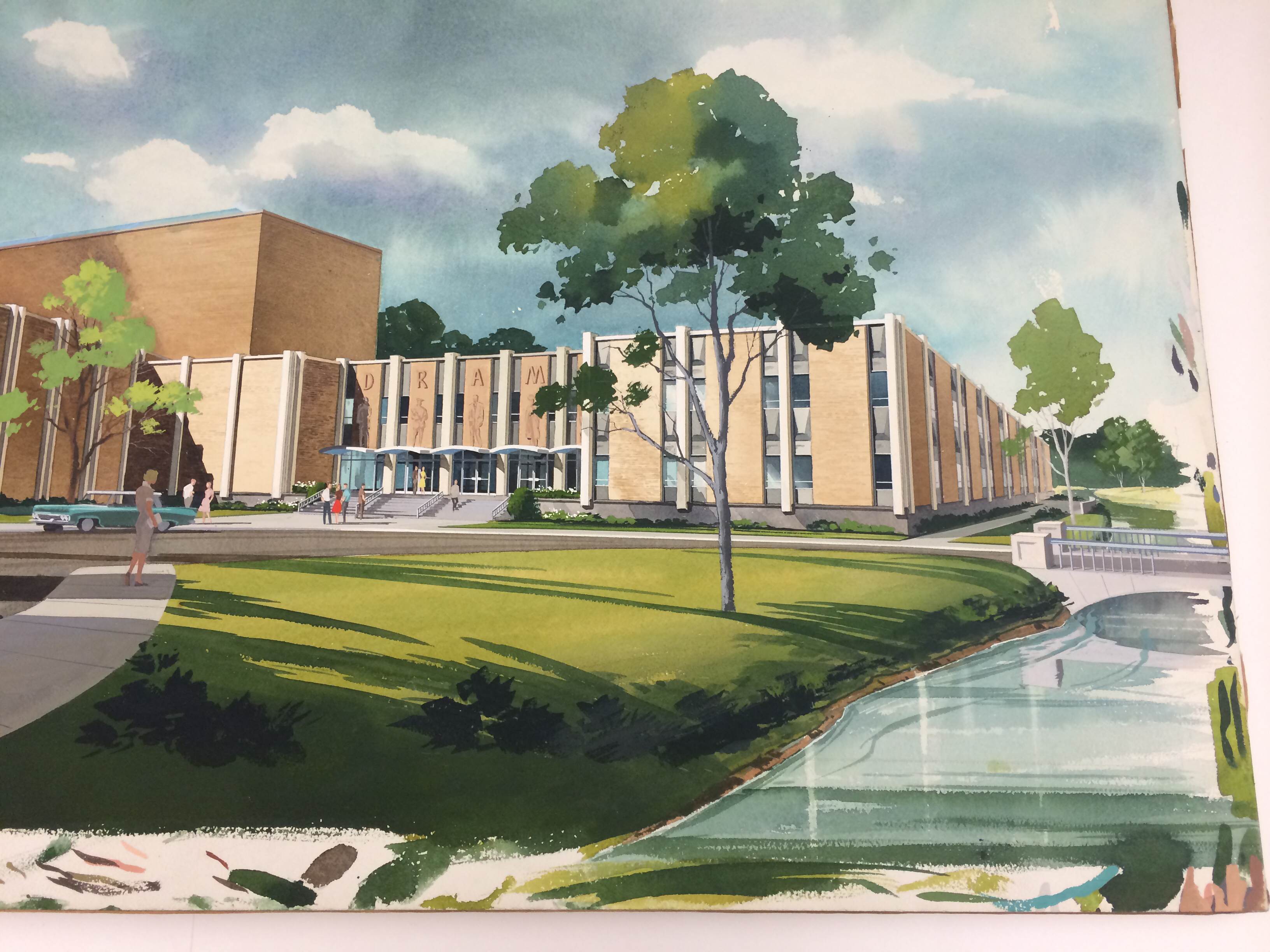
To kick off a series of blog posts recapping the Spring 2014 semester, we figured we’d start with one of the most visually captivating: watercolor renderings from our very own Alexander Architectural Archive.
Earlier in the semester, Judy Birdsong’s Visual Communications studio paid a visit to the Archive to check out some of our working drawings in order to see how they have changed over the years. This is a completely fascinating progression, and one of my personal favorite things to view when I visit the Archive for my own research needs. However, a few weeks later, students were assigned a project requiring watercolor — and the watercolor renderings the Archive has are an absolutely incredible resource!
I was lucky enough to be given a similar exposure to the Archive’s watercolors by Curatorial Assistant Nancy Sparrow, and I’m here to pass on the unbridled beauty. If any of you happen to have been looking to improve your architectural watercolor skills, the Archive is an unparalleled resource!
Throughout final reviews, a similar version of the same comment often comes to the surface: accurately conveying an architectural idea heavily depends on the way you draw or render your final presentation graphically. With so much focus on computer generated renderings in practice today, watercolors are almost slowly being vaulted into the ranks of a lost art. These stunning examples from the Archive showcase immaculate talent that displays a clear understanding of color, shadow, contrast, and fine detail by the artist.
We hope the following high-resolution images inspire you in some way, whether out of pure admiration, or to pursue a new (or revived!) technique in the renderings you produce yourself. Click on the below photographs to view in beautiful detail!
I cannot stress enough how valuable an experience it is to pay a visit to the Archive to see renderings, drawings, photographs, and even tools used by the greats we house in our collections. Not only are these collections inspiring, but they are reminders that there are endless ways to represent an architectural idea. I believe this last point is the most powerful, especially for students embarking on a career in architecture and design. The profession is inherently creative and open to interpretation – and you have the power to convey ideas in your own style!
Many, many thanks to Nancy Sparrow for bringing these pieces to my attention. We hope you take advantage of the Archive’s treasures for all of the semesters ahead!


