Tag Archives: special collections

Friday Finds!: Built In U.S.A.

Cover of Built in U.S.A. (Source: Museum of Modern Art)

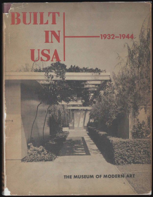
Written to accompany Art in Progress, the Museum of Modern Art’s fifteenth anniversary celebration exhibit, Elizabeth Mock’s 1944 book Built in U.S.A. is a portrait of an institution granting itself a victory lap for it’s role in establishing then-modern tastes. Taking their taste-maker status for granted, Built is the Museum’s attempt to assert itself as a great enough authority to not only say what is worth the audience’s time, but to lay out the foundations of the modern architecture canon. Mock, curator of Art in Progress‘ architecture section, uses her introduction to set-up a vision of the “modernist architect” as an individual whose work can walk in perfect balance between “present conditions and future needs.” (9) The utopian-minded ‘modernist architect’ works at odds with the skeptical public, who can only think of the “heat bills” and “glare” that result from the glass-heavy modernist home design. To Mock, these shallow critiques of modern architecture are born out of ignorance, critics who think all of modern architecture can be reduced to “large areas of glass.” (21) Her introduction posits a conflict between the modern style and the cult of practicality. Written in wartime, Mock condemns the point-of-view that states that architects are only there to provide “trimmings,” using the fifty examples in the text to show how architects straddle the line between the practical and the aesthetic. (9)

The Museum of Modern Art, as celebrated on pg. 88 of Built in U.S.A. (Source: Museum of Modern Art)

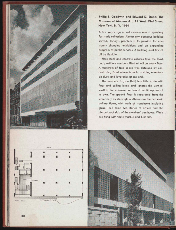
The subsequent two-thirds of the text showcase the fifty American buildings highlighted in the exhibit. Including several photographs of each structures’ interiors and exteriors, Mock also includes a basic floor-plan. Alongside the visual aspects, Mock features critical notes for each work highlighted. The book functions as a useful source if you are looking for contemporaneous reactions to buildings like “Falling Water” or “The Red Rock Amphitheater.” Perhaps the most striking choice in the text, considering the publisher, is Philip L. Goodwin and Edward D. Stone’s design for the Museum of Modern Art. Praising the architects, the notes also make a point to distinguish the museum as a “flexible” museum, distinguishable and new from the “static collections” that defined art museums in the past. (88) Built writes of the Museum’s architecture as essential to its functionality as a new type of museum.

For additional context around Art in Progress and Built in U.S.A., the Museum of Modern Art has recently provided scans of the three 1944 press releases promoting both to the general public. The best of the three articulates the goals of Built so well it is just as good of an introduction as anything within the text itself. Starting off with a quote from Park Commissioner Robert Moses debasing the Municipal Asphalt Plant (highlighted in Art in Progress and Built) as “horrible modernistic stuff,” the Museum holds it in regard as “one of the buildings… which best represent progress in design and construction during the past twelve years.” In the press release, Moses functions as a real-world version of the abstract ‘public’ Elizabeth Mocks talks about in her introduction. In openly clowning this establishment figure, the Museum not only heaps praise upon the artist, but on itself as a taste-maker. Built in U.S.A., and the marketing surrounding the exhibit and text, establishes an ‘us vs. them’ narrative with the stakes being the aesthetic, and the soul, of a nation. All of the materials the Museum of Modern Art has shared related to the Built in U.S.A. section of Art in Progress are essential to understanding what the discourse surrounding architecture was like in the mid-20th century.

You can read Built in U.S.A. in our Special Collections (or even in the PCL stacks!). Or you can read a PDF (as provided by the Museum of Modern Art) here, further exploration of the Built in U.S.A. section of the Art in Progress exhibit can be found here.

Friday Finds: Store Fronts

Hannah Stamier recently blogged about the Bon Marché and Émile Zola on ARTstor’s blog, highlighting images from their collection- which I remembered when I happened across some books on a similar topic. ARTstor is of course an excellent resource; however, I would also encourage you to explore the works in Special Collections on department stores and store fronts, if this topic is of interest. I pulled four books today as examples—

Dan, Horace. English Shop-Fronts, Old and New; A Series of Examples by Leading Architects, Selected and Specially Photographed, Together with Descriptive Notes and Illustrations, by Horace Dan, M.S.A. and E.C. Morgan Willmott, A.R.I.B.A. London: B. T. Batsford, 1907.

English Shop-Fronts is both a history of the building type and advice for designing anew. The first chapter discusses the history of early shop fronts, while chapter two, modern ones. The final chapter is a discussion of the practical aspects of the front: materials, glazing, lettering, lighting, and  entrances, for example.  Dan includes 52 plates, primarily from England and Scotland.

Geo. L. Mesker & Co. Store Fronts. Evansville, IN: The Company, 1911.

Unlike the other works that I selected today, Store Fronts is a catalog, produced by Mesker & Co. of Evansville, Indiana, from which a proprietor could select the design of a store front or other architectural details and materials. The catalog includes designs for concrete, brick, and galvanized iron fronts along with cornices, stamped steel ceilings, and elevators.

Curious about the company itself, I found the website, Mesker Brothers, maintained by Darius Bryjka of the Illinois Historic Preservation Agency. The site includes a discussion about the facades, the company catalogs, and documentation of the store fronts by state.

Herbst, René. Modern French Shop-Fronts and their Interiors. with a Forward by James Burford. London: John Tiranti & Company, 1927.

Following a brief introduction, Modern French Shop-Fronts and their Interiors consists of 54 large plates. Herbst writes:

Our opinion is that a shop front should be sober and be composed almost exclusively of a dressing of its own pillars, or of a covering which dissimulates blinds, gratings, and lighting fixtures. It should, however, provide ample space for the sign and lettering which are important from the advertising point of view, yet everything should be subordinated to the merchandise itself- which should occupy the largest space and be displayed under a judicious lighting arrangement so as to focus the attention of the public. (Introduction)

For an example of Herbst’s work, see plate 17 from Magasins & Boutiques.

Lacroix, Boris J. Magasins & Boutiques. Paris: C. Massin [194-?].

Magasins & Boutiques is a collection of 36 plates of store fronts and interiors in Paris. Lacroix includes stores, boutiques, shops, and restaurants or bars. A very brief description accompanies the plates along with the name or the architect or decorator; however, dates have not been provided.

Feature Friday: Perusing the Past

Happy August, everyone! Where does the time go?! Aptly, for this week’s Feature Friday, we’re getting a bit nostalgic.

Almost a year ago, I wrote a post revealing how a library is actually so much more than just a place to rent books for research. It’s often a place of communal solitude, where the focus of those surrounding you miraculously rubs off on you during a study crunch; a place of calmness, predictability, and ease, where methodical sounds of footsteps pacing the stacks, the beeping of barcodes, and the flipping of pages enfolds you and makes you feel truly comfortable in the space you’re in; and, most importantly, a place for inspiration, a place where you’re completely surrounded by thousands of books that you know you’ll never even touch, but could if you had the chance. I mean truly, what is more beautiful than a place that habors an endless amount of knowledge?

That’s why this particular Feature Friday focuses on something that’s not a unique feature to this specific day, week, month, or even year; it’s a feature that is present each and every hour, minute, second that we’re open: our stacks.

More specifically, here at the Architecture & Planning Library, our second floor harbors hundreds of solid-color, stately-looking hardcover books that are actually a few issues of journals bound together to form one convenient package. Those of you that have done research in our library likely know exactly what I’m talking about: the rows and rows of navy blue, evergreen, and maroon shells that make you feel like you gain intelligence simply by walking through (“contact intelligence” if you will – can I trademark that term?). Most researchers, however (including myself!), tend to start by looking up a specific topic in the catalog, jotting down a call number, journal name, issue number, and page range, and beeline straight to that specific journal.

There’s nothing wrong with that by any means, and I love when I have the opportunity to utilize sources other than the internet. However, today I’d like to encourage you to consider exploring these journal archives without a particular goal in mind, just to see what you find – especially if you’re studying an architecture or design-related major!

…Why, you may ask? The idea of blindly pulling a plain-covered book and flipping through its pages seems a little counter-productive versus the typical strategy of spine shopping in a library or bookstore. However, I’ve come to realize that discoveries found without a clear-cut end product in mind are often the most fruitful. Here’s an example:

Above is a photo of a two-page leaflet found in the July 1964 issue of Architectural Forum. (Yes, you read that right – 1964 – and we have issues dating back to 1917!) Aside from staring wide-eyed at the advertisements that made me immediately want to rewatch seasons one through six of Mad Men, this article caught my eye due to its detailed plans, sections, and sketches that were 100% created by hand. The spread depicts the plan to bring Pennsylvania Avenue – Washington D.C.’s most prominent thoroughfare – back to its original grandeur. The White House is located in the top left corner, and the avenue runs to the Capitol at the bottom left. Immediately, I went to the ever-useful Google Maps to compare what was so beautifully illustrated in 1964 to what the exact area looks like today.

So. Awesome.

It’s discoveries like these that continually drive my insatiable curiosity to explore beyond what I’m required to. I’ve only been to Washington D.C. once – when I was in elementary school – and can assuredly tell you that I was not particularly fixated on assessing the quality or design of the public spaces around some of our nation’s most prominent and vital monuments at the time. I am now, however, fascinated by comparing elaborate plans conceived decades ago to how they were ultimately implemented into city fabric. Additionally, I was flooded with questions: how was this space adapted over the years? What concepts of the 1964 plan were removed from the final product? Were they actually there originally, but replaced over time by something else? How does this comprehensive scheme work today? Is the social experience as lively as intended? Did it ever function as intended?

By simply paging through a journal from decades ago, I have stumbled upon a topic that I could potentially develop a research paper on – or even a thesis or dissertation that expands its sample into a broader inclusion of major city plans over the years. How rewarding is that?! This is why I encourage you – or any user of any library across the globe – to peruse the past without a purpose. You’ll learn what interests you without an assignment looming over your head – which is a peril of many students!

Summer is as good of a time as ever to explore, and we’ve but a mere month of it left. What better way to beat the heat than jumping into a visual time machine and uncovering traces of the past that you had no idea existed?

Sounds like a great bucklist item to me.

Society of Architectural Historians Conference in Austin: Then and Now

It’s official: The Society of Architectural Historians Annual Conference is underway in our beloved Austin! Please visit here for a full listing of the conference’s events.

Because of the conference’s focus on architectural history, along with the opening of Emily Ardoin’s exhibit “Inside Modern Texas: A Case for Preserving Interiors,” we decided to delve into our archive’s bountiful resources to see if we could uncover material that was especially pertinent to the conference’s visit. The Alexander Architectural Archive holds the namesake of Drury Blakeley Alexander, architectural historian and Professor Emeritus at the University of Texas, who was an active member of the Society of Architectural Historians and believed wholly in the value of archival materials and research.

This fact was proven when Donna Coates, our Curatorial Assistant for Technical Services, informed me that Alexander’s collection included folders upon folders of saved Society of Architectural Historians conference materials. These folders contain invitations, programs, general correspondence, and more! I couldn’t believe that such a treasure is held within our very own Archive walls, provided by the namesake of the Archive itself. I also gained respect for low-grade hoarders; if I could high five Alexander for ensuring he retained nearly ALL of the materials of the conferences he attended, I totally would.

One of the many postcards addressed to Alexander inviting him to SAH Conferences. This one is dated 1953 from New York City.

As I began sifting through the boxes that contained these folders, I became overwhelmed with the material. I also found myself simultaneously wishing that I could round up every interested individual in the Austin area and show them all of these wonderful treasures that Alexander had left for Archive users to potentially uncover and explore. As I grappled with the best way to present this material – ranging from the conference held 50 years ago, to showing snippets of material from every recent decade – I finally stumbled upon the folder I was looking for: the SAH Conference of 1978, which was held in nearby San Antonio.

The official brochure of the 31st Annual Society of Architectural Historians Conference amidst additional documents and correspondence.

This folder was so much fun to sift through, as it was full of correspondence between Alexander and professors from neighboring Texas universities. Alexander, for the 31st annual conference, wanted to bring together architectural history professors from across Texas and set up a collaborative session on Texas architecture – very similar to this year’s Austin Seminar. His dedicated effort to weaving a special Texas flair into the 31st Annual Conference was apparent, and, as evidenced by the official conference material from that year, certainly was not a fruitless effort. The conference featured several speakers presenting on topics relating to architecture in Texas, and he helped plan a day tour to Austin to unfurl the treasures that serve as some of the cornerstones of our great city.

A tour map of Austin for the conference. I want to go on this today!

Looking through these folders not only made me excited for this year’s Society of Architectural Historians Conference, but also reaffirmed how lucky we are to have such an incredible Architectural Archive as a resource for research and beyond. It is truly fitting that the namesake of the Archive contributed so greatly to the field of architectural history. Cheers to you, Blake Alexander!

Here’s the text tour associated with the above map. In addition to this week’s conference events, this may be a fun addition to your lineup – comparing Austin’s urban fabric to what was in 1978!

Frank Lloyd Wright’s Posthumous Contribution: An Icon of a City

While searching for all of the items in Karl Kamrath’s Collection last semester, I was directly exposed to the vast depth and diversity of a successful architect’s personal library. From Alden Dow to Katherine Morrow to Richard Neutra, Kamrath’s collection spanned decades and encompassed elements of major movements and achievements in the 20th century.

While his collection contains some quintessential readings that were quite prolific (such as Louis Sullivan’s Kindergarten Chats and Other WritingsHassan Fathy’s Architecture for the Poor: An Experiment in Rural Egyptand Frank Lloyd Wright’s The Future of Architecture), there are also some limited publications of several design projects that Kamrath and his firm were associated with. As I sifted through special collections to find these professional reports, one caught my eye before I even noticed the Kamrath Collection stamp on the cover: The Monona Basin Project.

My interest directly stems from the report’s subject: a schematic master plan for the city of Madison, Wisconsin. As a University of Wisconsin graduate who spent five years in Madison, I was immediately intrigued by the possibility of being able to compare my visual of Madison with a plan dating back to 1967.

For anyone that’s either been a resident of the greater Wisconsin-Illinois area or happens to be a Frank Lloyd Wright buff, you know that Wright’s career began in Madison as a student at the University of Wisconsin. Though he never completed his engineering degree, he went on to realize many significant projects in Madison and the surrounding area, including the Robert M. Lamp House, Unitarian Meeting House, and Taliesin in nearby Spring Green, one of his most famous projects. However, Monona Terrace likely possesses one of the most interesting timelines of all of Wright’s works – and I’m here to share that story with you all!

Wright originally envisioned a “dream civic center” for the city of Madison as early as 1938. Situated along the shores of Lake Monona – one of Madison’s largest lakes – and within walking distance from the state’s Capitol building, his initial plan called for a rail depot, marina, courthouse, city hall, and auditorium. However, the County Board turned down his proposal with a single vote.

In 1941, approval for a municipal auditorium was passed, and Wright presented a modified version of his Monona Terrace plan to the board yet again. However, instead of another rejection, a different conflict intervened – World War II. That very same inhibitor proved to be a catalyst for Wright’s project after the end of the war, as the economy boomed; Wright was ultimately selected as the architect for the project in 1954. He was quoted as saying his appointment of project architect for the Monona Terrace by the voters of Madison meant more to him than any other award at the time.

In 1959, Wright completed his last rendering for the project. Later that year, he passed away in August – followed by the opening of the iconic Guggenheim Museum in New York City in October. Scholars have noted the striking curvilinear similarities in form and intent between the Guggenheim and Wright’s plans for the Monona Terrace – similarities tat would not be realized until decades later.

In 1966, the site of the Monona Terrace project was revisited, and Taliesin Architects were recruited to develop a master plan for the site and the city. This schematic proposal, which became known as The Monona Basin Project, is outlined in Kamrath’s copy of the same name.

The renderings and drawings within the pages of this proposal are absolutely stunning. Full of both organic and geometric shapes and careful, sinuous line work, the pages seem tinged with the memory of Frank Lloyd Wright.

For those of you that have never visited Madison or studied the Monona Terrace, you may think this is the end of the story, right?

False. This elaborately documented proposal – which included three miles of shoreline; the redevelopment of Olin Park, located across the lake from the Monona Terrace; and the beginning phases of a 2,500-seat performing arts center – was excessively over budget and subsequently halted by the mayor! I know, I know – the rate at which I’m curating this story makes it seem like it was a imaginative project and never completed. But I promise, it’s real.

Throughout the 1980s, several proposals for a new civic center in Madison were submitted by developers – but all of them failed. In the early 1990s, the then-mayor heavily lobbied for the support of reviving Wright’s original 1959 proposal and turning his vision into a reality.

Finally, between 1992-1994, funds were allocated from a number of sources, and the construction on Wright’s civic center began. Its interiors were redesigned by the Taliesen architect Tony Puttnam, and in 1997, the Monona Terrace was opened to the public – 59 years after the original inception of the project and 38 years after Wright’s death.

Today, the Monona Terrace is a hub for cultural events, weddings, professional conferences, and more. As a frequent visitor during my Madison days, I can confirm that Frank Lloyd Wright’s contributions to the project are highly celebrated and integrated into nearly every facet of the user experience; for example, the grand hallway from the main entrance functions almost as a gallery of Wright’s work, lined with photographs of projects spanning his entire lifespan. This posthumously-built icon of a city, full of a tumultuous and contested history, is one of my favorite Wright-influenced works, and gives a glimpse into the incredible complexity behind the ideation and completion of an architectural project.

Searching for all of the books in Karl Kamrath’s collection has proven to be one of my most educational experiences. I have learned more about the cities I love – Madison, Chicago, Austin, and more – and delved into the sources of inspiration of a successful architect. Stay tuned for another blog post on a similar proposal involving Pennsylvania Avenue in Washington, D.C., also from Kamrath’s collection. These behind-the-scenes stories are so fun to tell!

Interested in exploring the Monona Basin Project in detail? The title discussed above is housed in our Special Collections under the call number -F- NA 9127 M33 T35 1967.

Karl Kamrath’s Stamp Left on Books Throughout the Library (Literally)

Throughout the past few weeks, I’ve been on a search for all 176 of Karl Kamrath’s books from the collection his children donated to the Architecture & Planning Library, with the goal to add a provenance note to each item’s record in the catalog (so all of you checking out books can know that it belonged to an influential architect!). At first, the project seemed just like just another task to complete – but it’s become so much more.

It’s amazing how much you can learn about an architect’s primary influences through the books he or she possessed. A hearty library is like a trophy for architects, and books are indispensable tools for practice. Karl Kamrath was immensely influenced by his friend Frank Lloyd Wright, and his dedication to creating organic modern architecture is what made him such a key player in Texas modern architectural history.

A little background: Karl Kamrath grew up in Austin and received his Bachelor of Architecture from The University of Texas in 1934. Upon graduating, he moved to Chicago, where he worked for Pereira and Pereira, the Interior Studios of Marshall Field and Co., and the Architectural Decorating Company. In 1937, he and another graduate of The University of Texas, Frederick James MacKie Jr., opened their own architectural firm, MacKie and Kamrath in Houston. MacKie and Kamrath were among the first Houston architects to follow a modernist approach to design for which they received national recognition.

Shortly after his 1946 return from a stint as a captain in the Army Corps of Engineers, Kamrath met Wright and immediately became an advocate of Wright’s Usonian architecture style. Kamrath became a member of the American Institute of Architects in 1939 and was elected to fellowship in the institute in 1955, and at various times served in an adjunct capacity at the University of Oklahoma, The University of Texas, Texas A&M University and the University of Oregon. He was also a founder and served on the board of the Contemporary Arts Museum from 1948 to 1952.

The fact that books owned by successful architects are circulating every day is a phenomenal asset of the Architecture & Planning Library. Other great collections include those of William Storrer, another Frank Lloyd Wright scholar, and Drury Blakeley Alexander, the namesake of the Alexander Architectural Archive, to name a few. I may be a little biased, but Karl Kamrath’s collection might be my favorite, mainly because of the diversity of publications and his signature ‘stamp’ that is found within the covers of most of his books.

Here are few that I’ve come across:

Perhaps my personal favorite, Kamrath drew his logo directly within Frank Lloyd Wright’s signature red box, found on most publications documenting his work. It’s clear just how influential Wright was on Kamrath.

Kamrath’s stamp can be found on a number of pages in some of his books. I thought this placement was especially unique.

Though faint, a raised stamp often accompanies many of Kamrath’s books with his logo, name, and FAIA association.

In addition to books with Kamrath’s personal stamp, many can be found with the joint MacKie and Kamrath firm logo.

Stamps aren’t the only thing you’ll find within the books of former owners. Notes or correspondence between friends and other practitioners is fairly common, and sometimes can leave you star struck.

Yep, that’s THE Mrs. Frank Lloyd Wright! This was taped on the back cover of The Grady Gammage Auditorium, call number NA 737 W7 A4 1964, within special collections.

Want to see some of these stamps and inscriptions for yourself? Here are a few that are circulating in the general collection:

Writings on Wright, Call Number NA 737 W7 W76, Copy 2
Frank Lloyd Wright: An Annotated Bibliography, Call Number NA 737 W7 S84, Copy 2
Ludwig Mies van der Rohe, Masters of World Architecture Series, Call Number NA 1088 M65 D7, Copy 4

The next time you check out a library book, keep an eye out for any markings on the front cover or amidst the pages; you might find a trace of its previous ownership. There’s hidden gems all over this library – it’s like a treasure hunt!

In addition to an extensive library with books in the general collection, special collections, and storage, The Alexander Architectural Archive possesses an incredible archival collection dedicated to the work of Karl Kamrath and the MacKie and Kamrath firm, including over 940 drawings, 530 black and white photographic prints, and even drafting tools. I’m a total sucker for hand drafted architectural renderings, and Kamrath produced some of the most beautiful that I’ve seen! If you have serious interest in viewing this collection, make an appointment with Nancy Sparrow to take a peak.

Baedeker’s Travel Guides

In addition to being a man of wide and varying interests, Blake Alexander was also extremely well traveled and amassed a great many guide books and travelogues over the course of his life. Although many of these have since become outdated and should, therefore, probably not be used to for any type of serious vacation planning, these titles can still be chock-full of useful information for historians and preservationists alike.

One of the most enchanting items now in our library is a series of 35 Baedeker’s Travel Guides. Known for their straightforward advice and meticulous detail, these little red books were first published by Verlag Karl Baedeker in 1827. English language publication began in 1861 and soon the guide books were considered an essential part of the tourist’s arsenal. The books, which included maps, route recommendations, and a star system for rating sights and accommodations, were once culturally significant enough to be referenced in E. M. Forster’s A Room with a View and in Thomas Pynchon’s short story, “Under the Rose.” They also had a more nefarious use during the Second World War when Nazi propagandist Baron Gustav Braun von Sturm declared “We shall go out and bomb every building in Britain marked with three stars in the Baedeker Guide” right before the Luftwaffe embarked on a series of brutal attacks against the historic cities of Exeter, Bath, Norwich, York, and Canterbury.

Blake’s collection of Baedeker’s spans from 1884 to 1988, with the bulk of the collection falling before the 1940s. The countries represented in his library include Egypt, Italy, Greece, Switzerland, Canada, Belgium, and France, as well as the now defunct Austria-Hungary and Syria-Palestine. City guides include London, San Francisco, Paris, Vienna, Budapest, and Berlin. The United States with excursions to Mexico, Cuba, Porto Rico, and Alaska is one of my personal favorites from the series. Particularly relevant (and amusing!) is this description of Austin (including the University of Texas):

Austin (Driskill, R. $1-2 1/2; Avenue $2-2 1/2; Hancock $2-2 1/2), the capital of Texas, a pleasant little city with 22,258 inhab., lies on the Colorado River, in full view of the Colorado Mts. Its handsome red granite Capitol, finely situated on high ground, was built by Chicago capitalists in 1881-88, at a cost of 3 1/2 million dollars, in exchange for a grant of 3 million acres of land. It is the largest capitol in America, after that at Washington, and is said to be the seventh-largest building in the world. Other prominent buildings are the State University (2290 students), the Land Office, the Court House, and various Asylums. The Monument to the Terry Rangers is by Pompeo Coppini. About 2 M. above the city is the Austin Dam, a huge mass of granite masonry, 1200 ft. long, 60-70 ft. high, and 18-66 ft. thick, constructed across the Colorado River for water-power and water-works. Lake McDonald, formed by the dam, is 25 M. long.”

Well, we’re still the second largest capitol!

Nuova Pianta di Roma

Nolli, Giambattista Nolli, Leonardo Bufalini, and Joseph Rykwert. Nuova pianta di Roma data in luce da Giambattista Nolli, l’anno MDCCXLVII. London: Architecture Unit, Polytechnic of Central London, 1977.

Along with the maps of Paris, several other map facsimiles were transferred from the Alexander Architectural Archive to the Architecture and Planning Library. One of these was Nuova pianta di Roma data in luce da Giambattista Nolli, l’anno MDCCXLVII, a 1977 reproduction of Giambattista Nolli’s (1701-1756) famous ichnographic map of Rome. Nolli began survey work on his map in 1736 and the map was published in 1748. Composed of twelve copper plate engravings that could be assembled into a nearly six by seven foot display, the “Nolli map” was revolutionary for both its accuracy (down to the asymmetry of the Spanish Steps!) and the way it distinguished between open civic and closed private spaces rather than simply denoting interiors and exteriors. This meant that not just the streets, but the cathedrals, Pantheon, and colonnades of St. Peter’s, were left white, while private buildings, walls, and columns were shaded in poché. The map, which is beautifully rendered in crisp black and white, is framed by Stephano Pozzi’s (1699-1768) elaborate vedute depicting St. Peter’s Square.

In addition to the Nolli map, this publication by Polytechnic College of London (now the University of Westminster) includes an introduction by the University of Pennsylvania’s Paul Philippe Cret Professor of Architecture Emeritus, Joseph Rykwert (1926- ), as well as Nolli’s reproduction of Leonardo Bufalini’s 1551 Pianta di Roma. An interactive version of the map, created by professors at the University of Oregon, can be seen here.

Library of Congress call number: Coming Soon!

Plan de Turgot

Bretez, Louis. Paris au XVIIIe siècle; Plan de Paris en 20 planches dessiné et gravé sous les ordres de Michel-Étienne Turgot, prévôt des marchands. Commencé en 1734, achevé de graver en 1739. Levé et dessiné par Louis Bretez. Paris: A. Taride, [1908?].

Bretez, Louis, André Rossel, and Michel-Etiene Turgot. Le Plan de Louis Bretez dit Plan de Turgot. Paris: Éditions les Yeux ouverts, [1966?].

Recently, the Architecture and Planning Library took possession of several books, that were originally housed in the Alexander Architectural Archive. These books, formerly owned by the late Blake Alexander, were transferred to the library’s special collections in order to allow greater access to students and researchers alike.

Two of the books, officially titled Paris au XVIIIe siècle; Plan de Paris en 20 planches dessiné et gravé sous les ordres de Michel-Étienne Turgot, prévôt des marchands and Le Plan de Louis Bretez dit Plan de Turgot, represent different twentieth century facsimiles of a the same publication, Le Plan de Turgot. Le Plan de Turgot, a detailed bird’s-eye view of Paris, is one of the most famous urban maps ever created. Commissioned by the prévôt des marchands de Paris, Michel-Étienne Turgot (1690-1751), in 1734, the map was realized by Louis Bretez over the course of five years. Bretez, a member of the Académie royale de peinture et de sculpture who specialized in architectural perspective, was given free reign to enter Paris’ mansions, houses and gardens in order to capture every building, window, tree, shadow and park in exhausting (and accurate!) detail. The completed map, consisting of twenty pages that could be assembled into a massive display of the first eleven modern-day arrondissements, was engraved by Claude Lucas and published in 1739. Lucas’ original plates are kept by the Chalcographie du Louvre where they could still (theoretically) be used today for printing.

Of the two reproductions, Paris au XVIIIe siècle, is the oldest. This book was published circa 1908 by Alphonse Taride, a Paris based publisher who specialized in maps, tourist guides, histories, and pocket plans of France. The other facsimile, Le Plan de Louis Bretez dit Plan de Turgot, is much newer having been published circa 1966 by Éditions les Yeux ouverts.

Library of Congress call numbers: -F- 912.4436 B755P and -F- 912.4436 B755P 1966.

Treasures from the Weinreb Architectural Collection

In 1968, a proxy working on behalf of the University of Texas Libraries walked into book dealer Ben Weinreb’s London shop and purchased his entire stock. There was no catalog and many copies existed in duplicate or bulk. In 1970, a visitor to the university noted that these materials were still in boxes, but eventually over 50,000 books, journals, drawings and papers were assumed into the architectural book collection at the Harry Ransom Humanities Research Center where many volumes remain available to scholars and independent researchers.

In the late 1980s, HRC, University of Texas Libraries and Architecture and Planning Library staff began discussing the possible transfer of Weinreb duplicates from the HRC to the Architecture and Planning Library’s special collections. This would lead to the infusion of over 5,900 of what Weinreb felt “were ordinary working books of value for the information they contained rather than their antiquity, rarity, or fine printing into the Architecture and Planning Library’s collection, increasing holdings by 15%.

Unusual among the architect and educator libraries stored in the Architecture and Planning Library special collections, the Weinreb Architectural Collection expresses no discrete professional or academic vision. Rather, Weinreb, who has been described as an “incorrigible buyer of bulk,” was an accidental architectural enthusiast whose “restless ambition to fortify [himself] with [a warehouse] full of stock” eventuated the assembly of both rare and ubiquitous volumes on architecture in English, Dutch, French, German and Italian. These materials address a range of topics including hospital and asylum architecture, the history of interior design, ornament, plumbing, metalwork and design theory. In addition, several monographs for great residential palaces complement other such folios held in special collections.

Stay tuned for more from the Weinreb Architectural Collection!